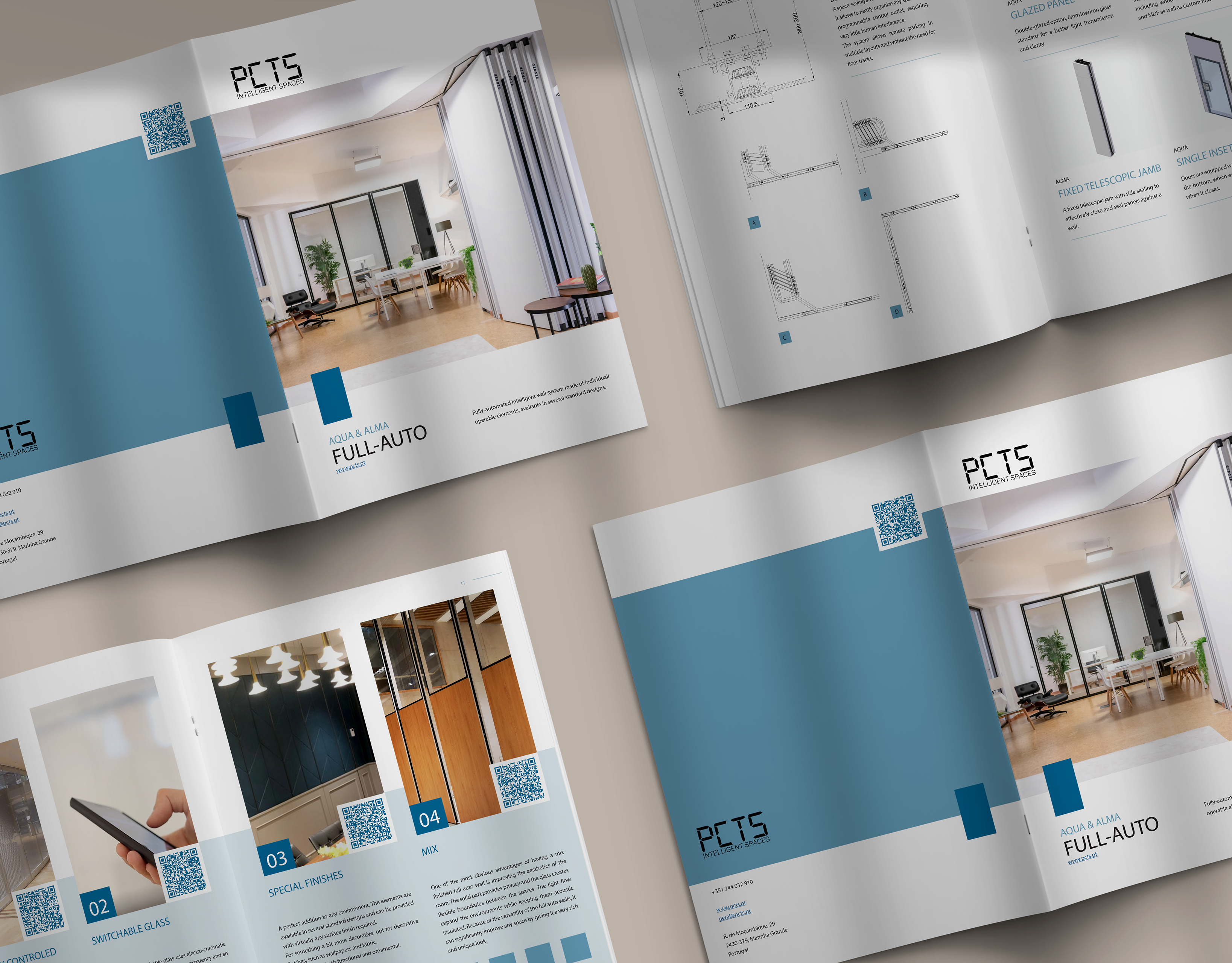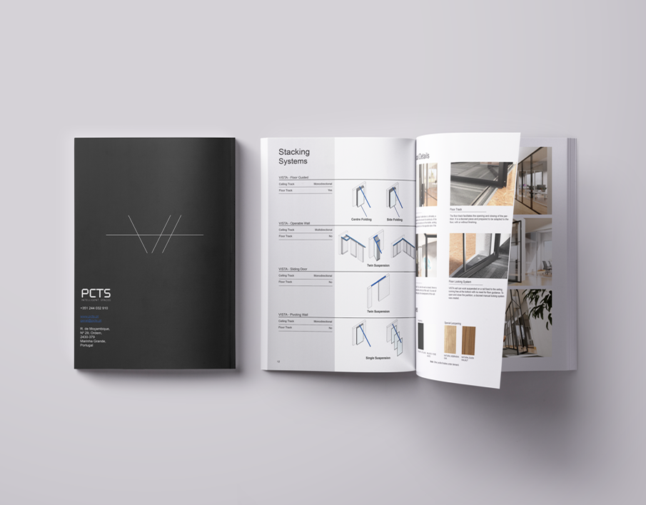
WINE LABEL
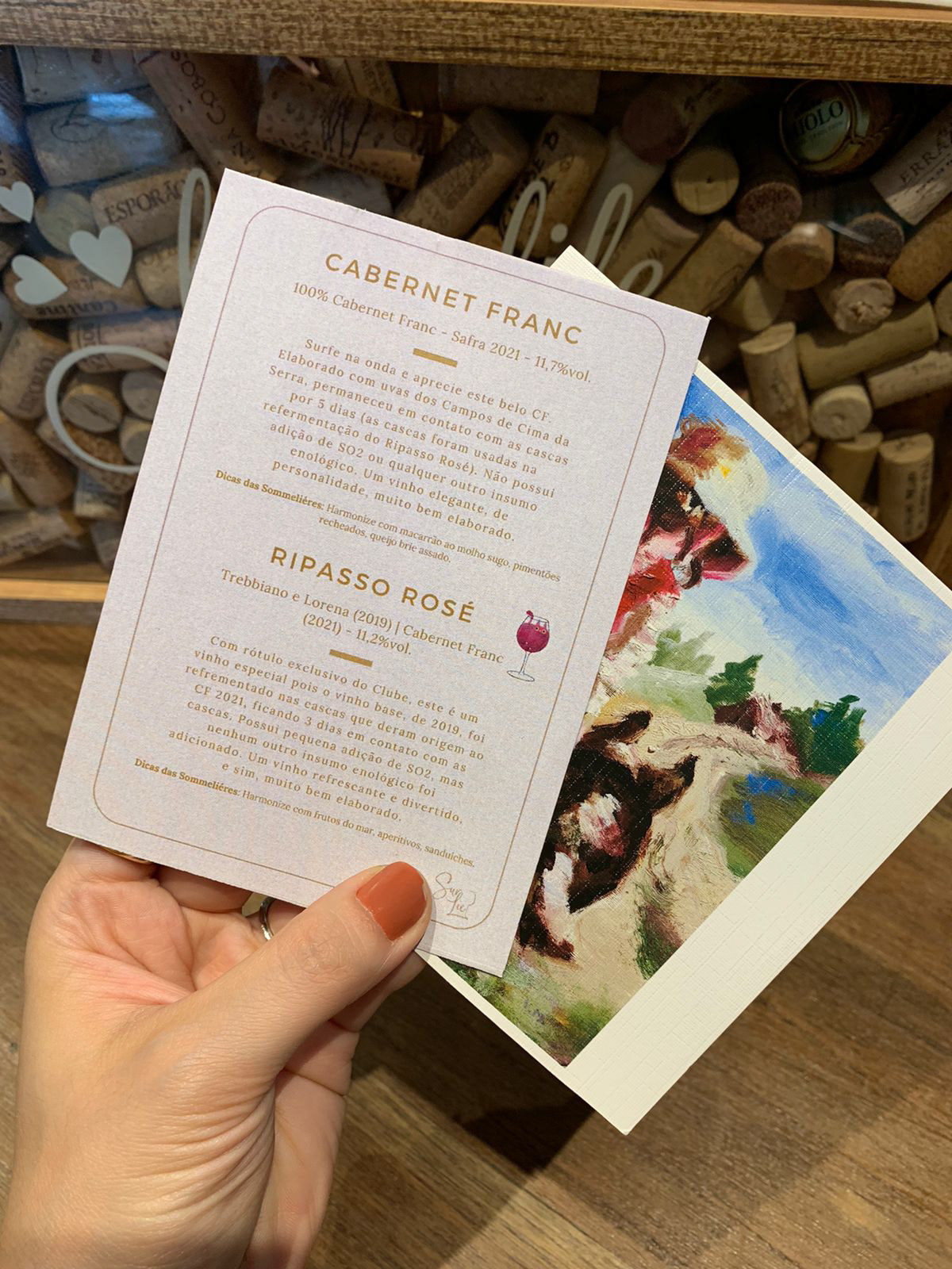
RIPASSO ROSÉ
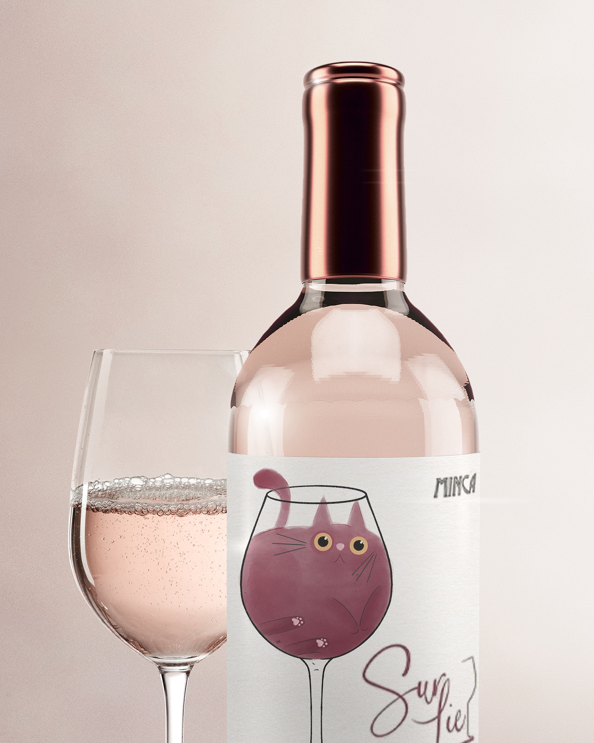
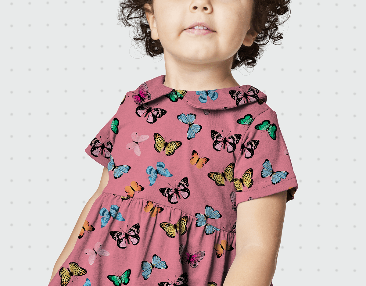
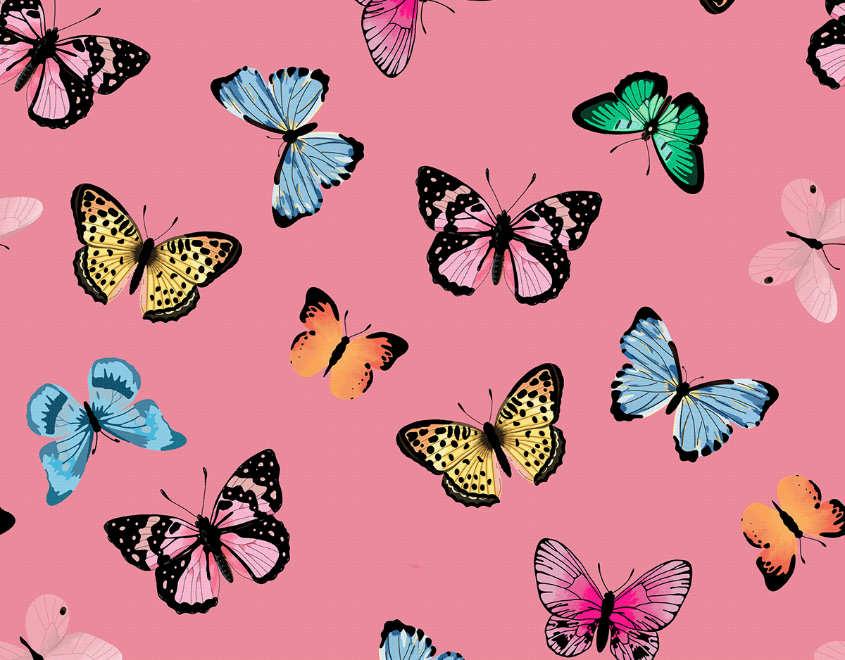
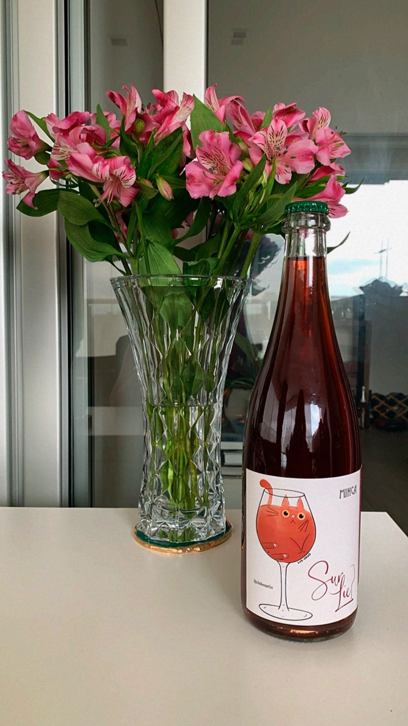
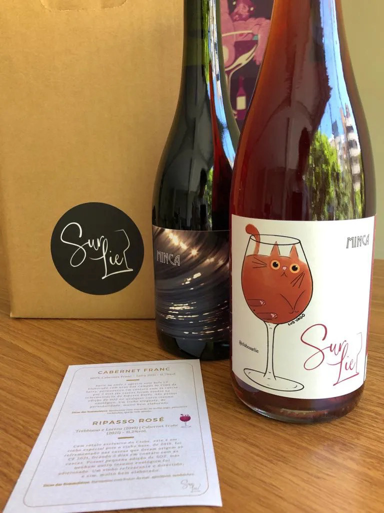
The illustration, created digitally with a watercolor effect, was a perfect match for Vinerize's new SurLie Box, specifically designed for one of their exceptional wines.
Vinerize was looking for a label design that would capture the essence of the wine and its unique production method. "Sur lie" in French translates to "on the lees," which refers to the practice of keeping the wine in contact with the spent yeast cells, without racking or filtering. It's a completely natural method that adds complexity and richness to the wine.
Drawing inspiration from this traditional winemaking technique, I carefully crafted an illustration that visually represented the SurLie Box wine. The watercolor effect added a touch of elegance and organic beauty to the label, perfectly complementing the wine's characteristics.
I'm thrilled to have contributed to the visual identity of this exceptional wine, and I hope my illustration brings a sense of artistry and appreciation to the overall tasting experience. Be sure to explore Vinerize's SurLie Box, which showcases exceptional wines crafted with time-honored methods.
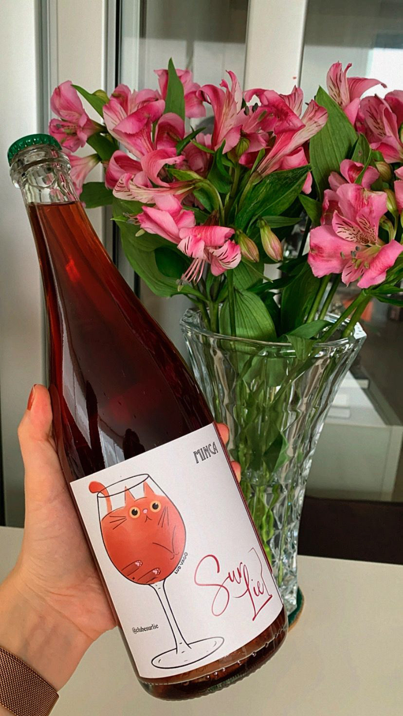
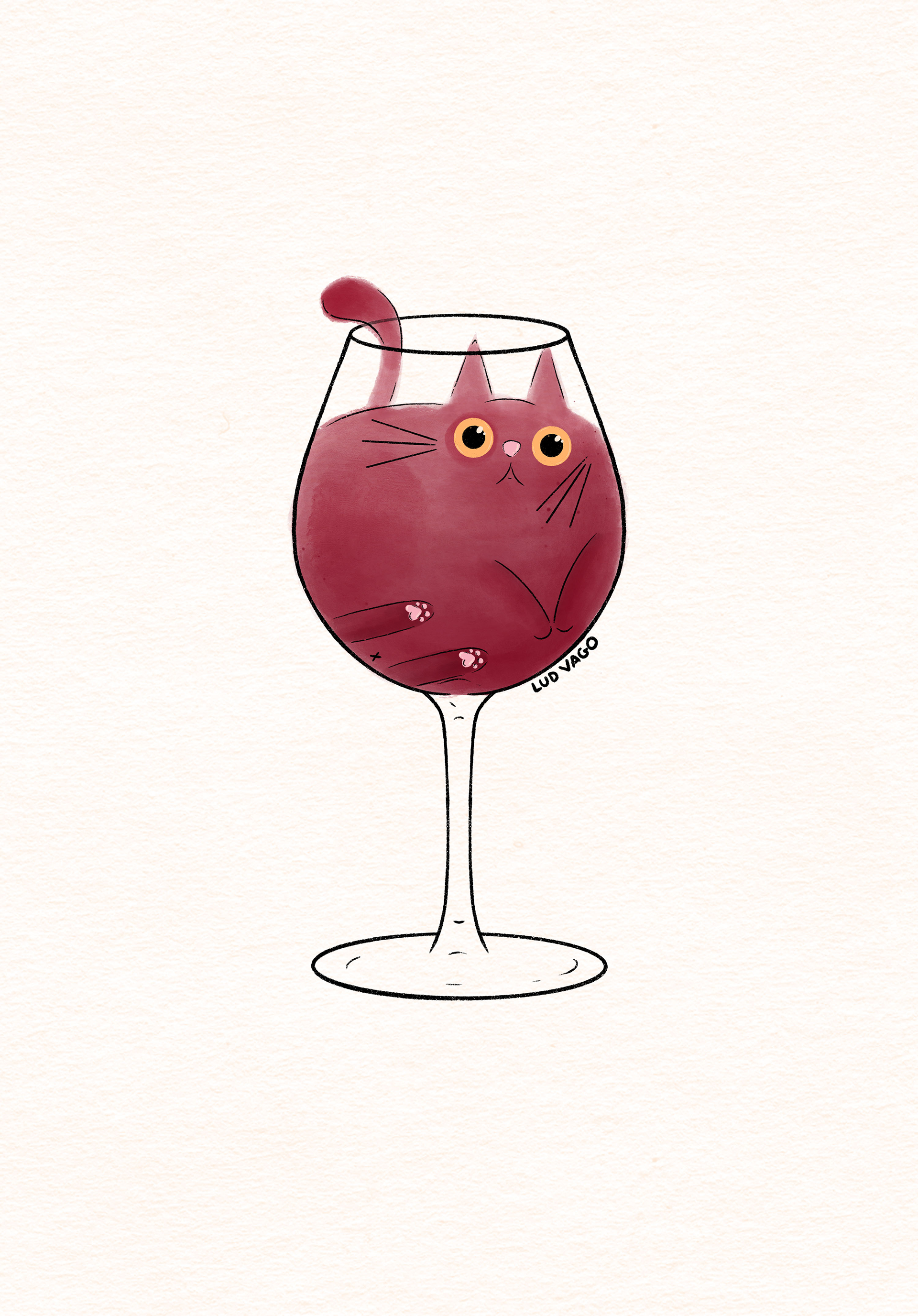
Ludmila Vago, 2022.